Branding Campaing | Porto Real Premium Water
Porto Real requested the creation of a concept for a communication approach to announce the new visual identity in advance, positioning the change as an evolution rather than a rupture. The goal was to reinforce the brand’s premium positioning while preserving its essence, heritage, and established perception of quality.
The concept:
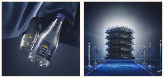
The creative direction was built around the metaphor of theatre curtains slowly opening. The new packaging remains partially concealed, with only subtle reflections of silver tones and the depth of blue visible. The bottles are presented in backlight, revealing only their silhouettes and the refined shine of the packaging, without fully exposing the new label colors.
This approach symbolizes a moment of transition and refinement for Porto Real. It reinforces the idea that premium positioning is not revealed all at once, it is experienced through anticipation. In this narrative, luxury is not immediate; it is carefully unveiled, building expectation and elevating perception over time.
After the curtains open, the scene reveals a premium corridor, where a deep blue carpet extends from the camera all the way to the shelf display. The new packaging is positioned at the center of the scene with strong visual presence, split into two distinct elements: a blue side and a silver side.
This composition symbolizes both commercial prominence and logistical organization. The carpet reinforces the brand’s leading role at the point of sale, while the updated color system enhances product differentiation, making it easier for consumers to recognize variants and supporting a more efficient stock rotation process.
Where the noble becomes even more absolute. Soon, a new Premium chapter. The experience you already appreciate, now with a renewed brilliance.
Campaign produced while working at the Otima Marketing agency. Graphic design by Arthur Mangussi. Copywriting by Mônica Minieri. Uberaba, Minas Gerais, 2025.
Postar um comentário